GENMOTION
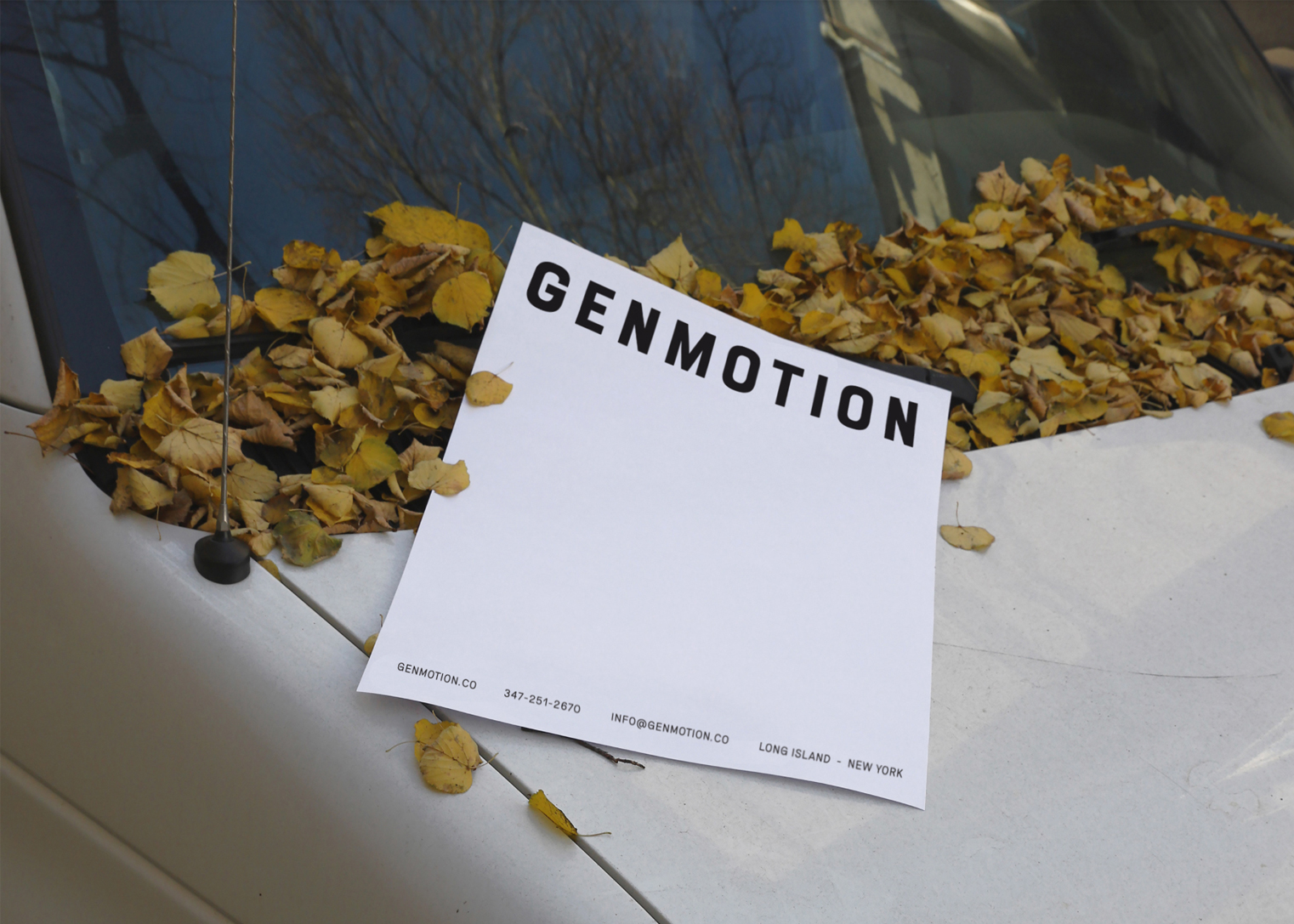
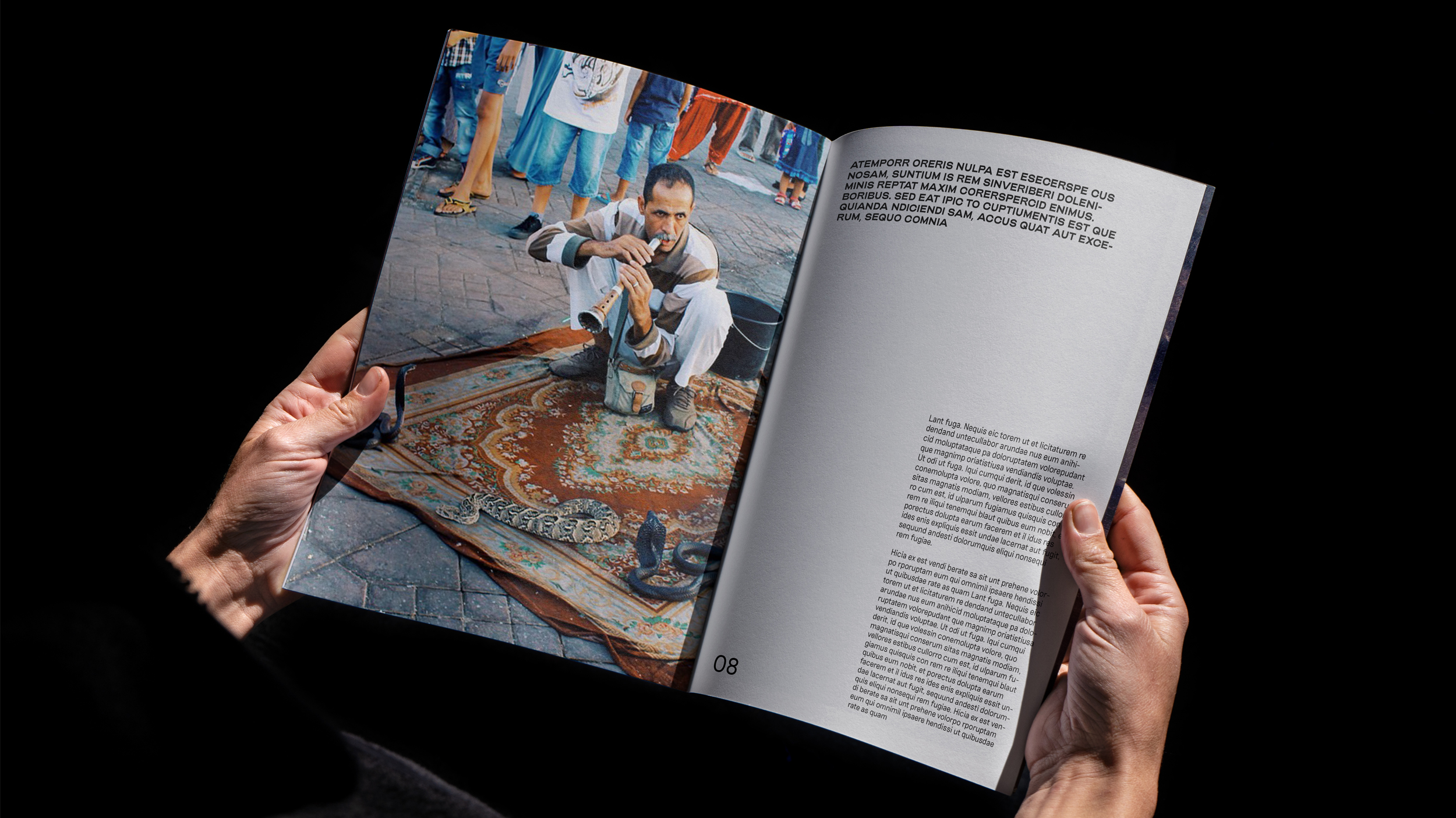
Our approach to the brand identity pays homage to the past. To an adventurous spirit, to the places Genmotion have traveled, and the stories they have told. It takes us on a road trip, a forward moving journey. There’s a sweet nostalgia to it with reference to vintage film posters, vintage car logos and type. While the identity is rooted in the past, a bold simplistic approach ensures that a timelessness ensues.
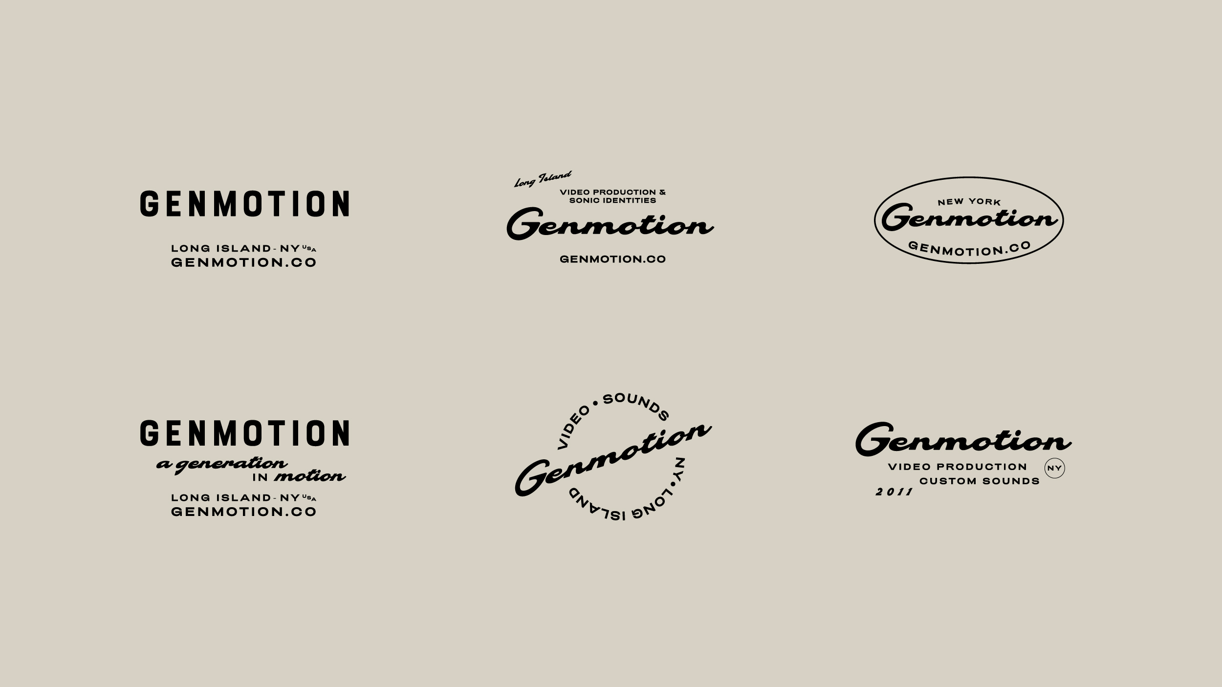
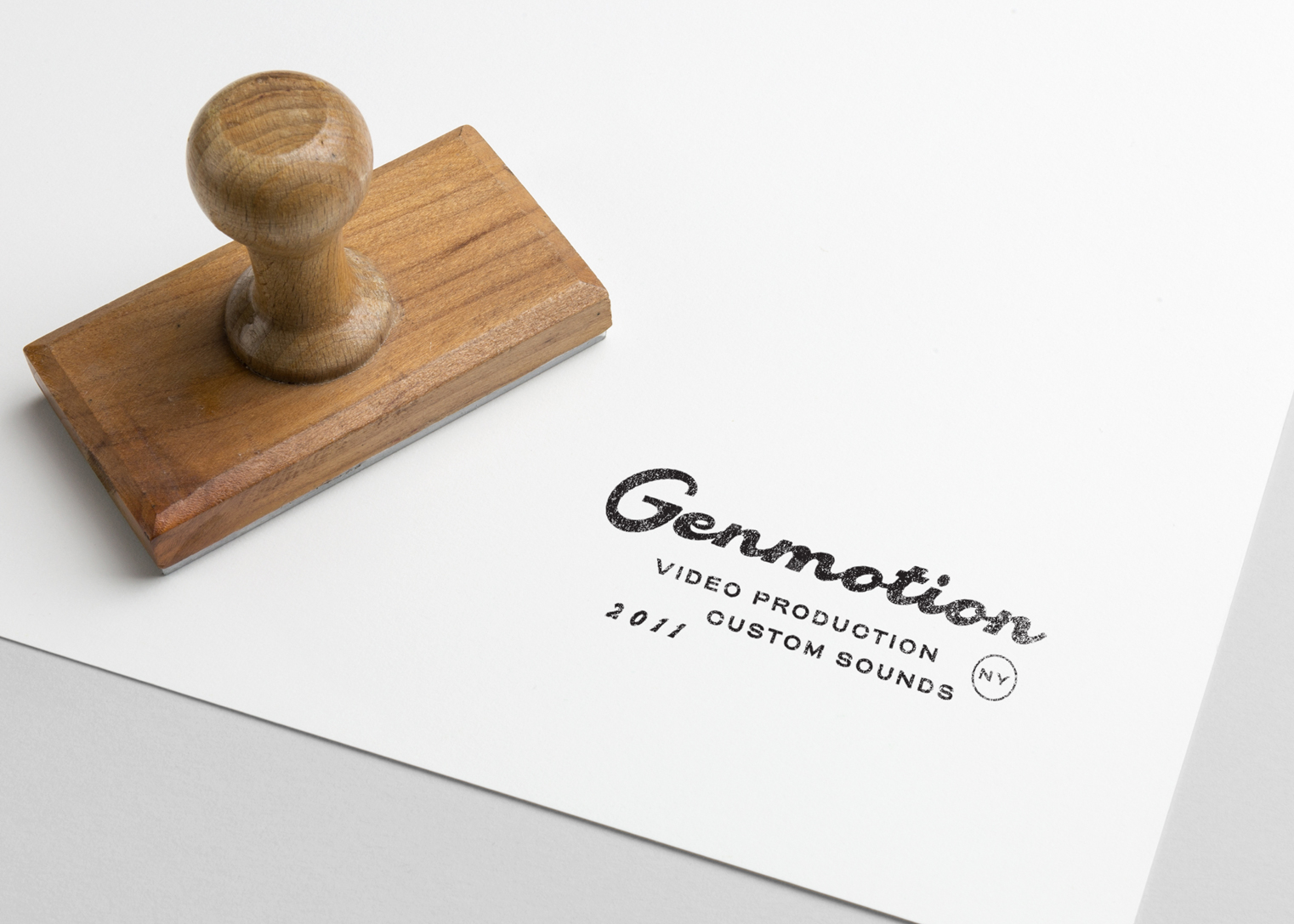
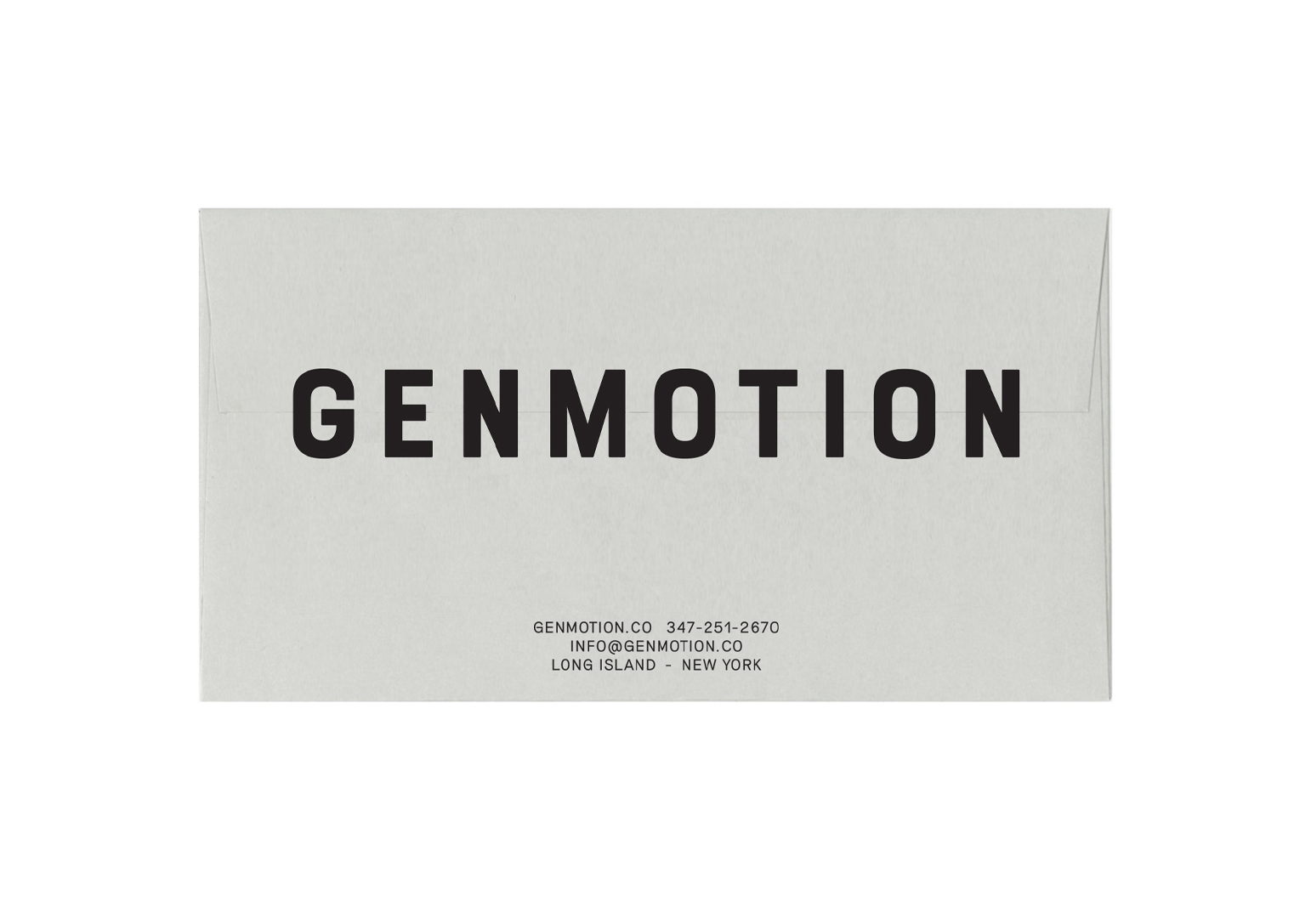
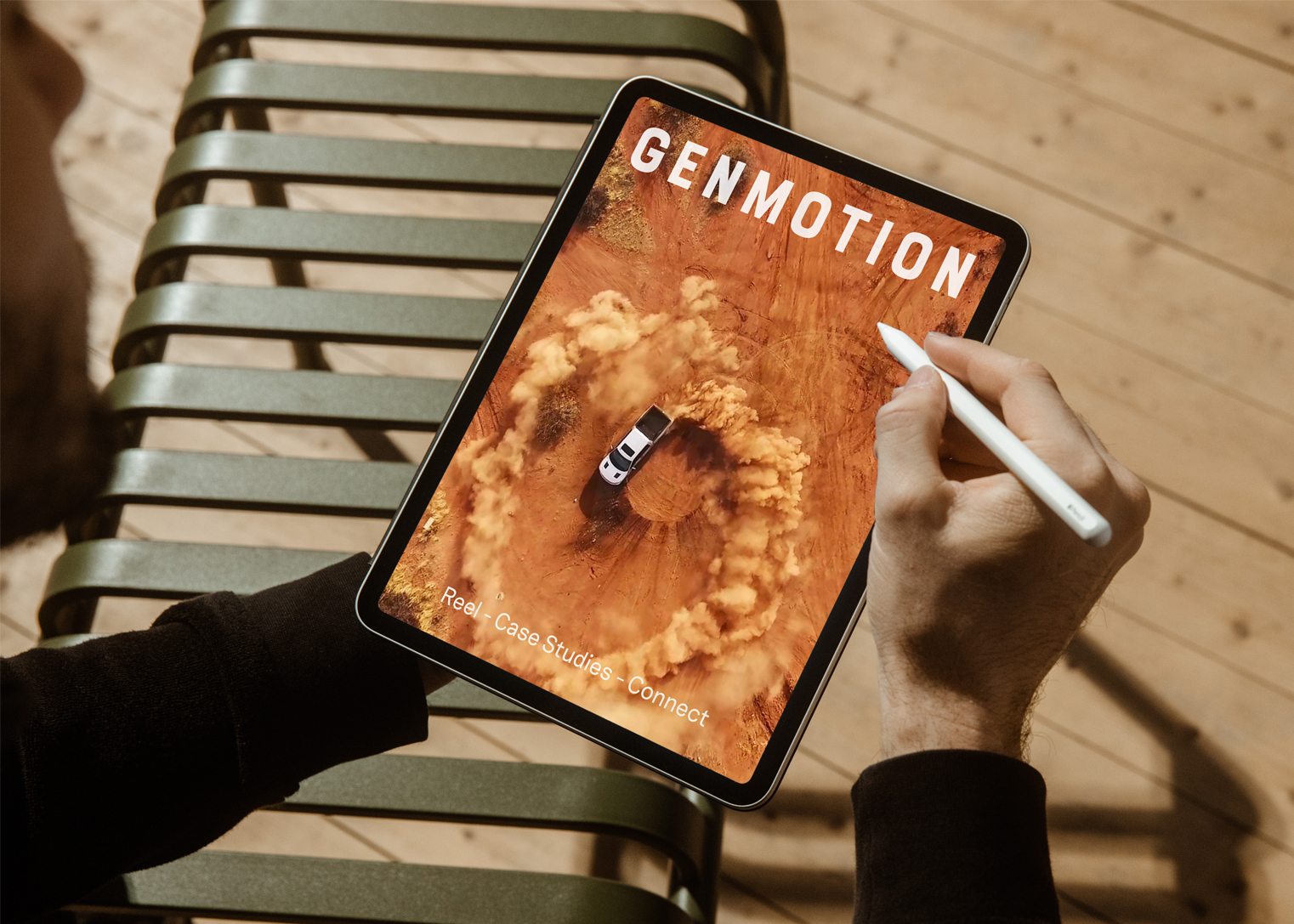
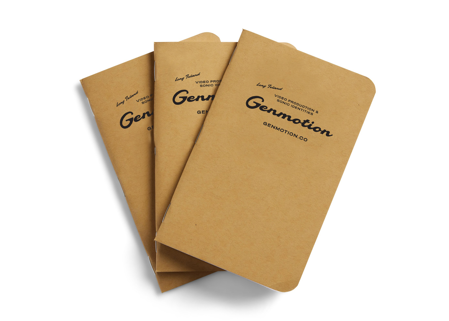
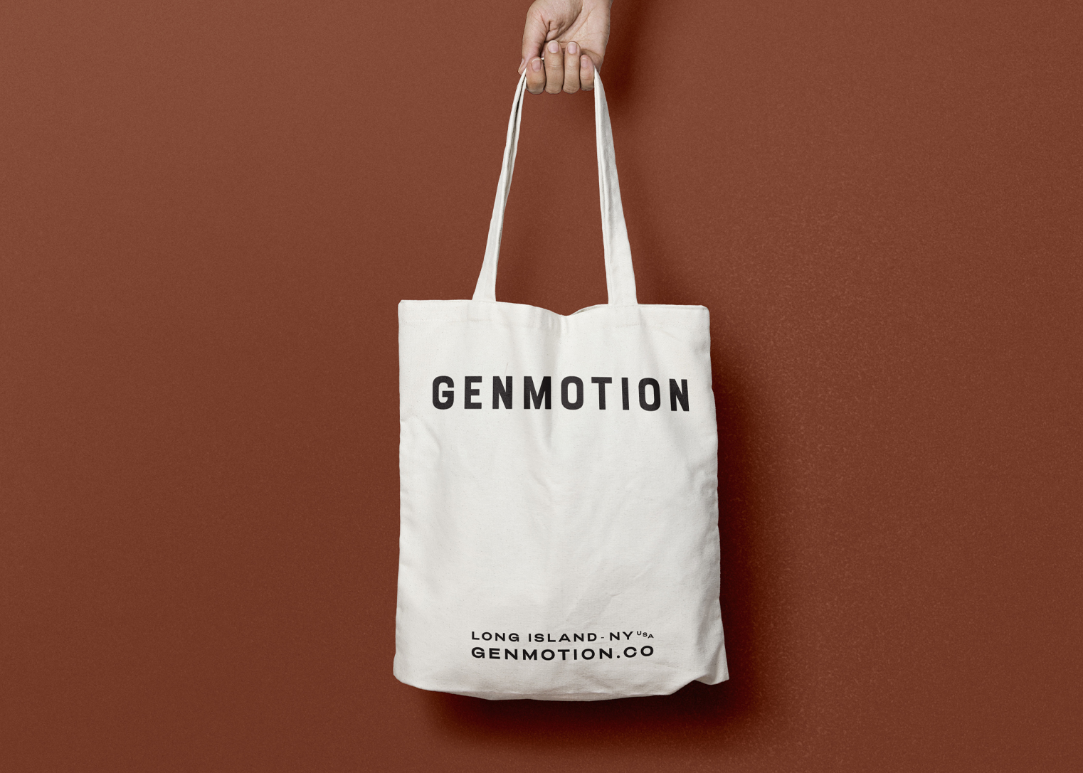
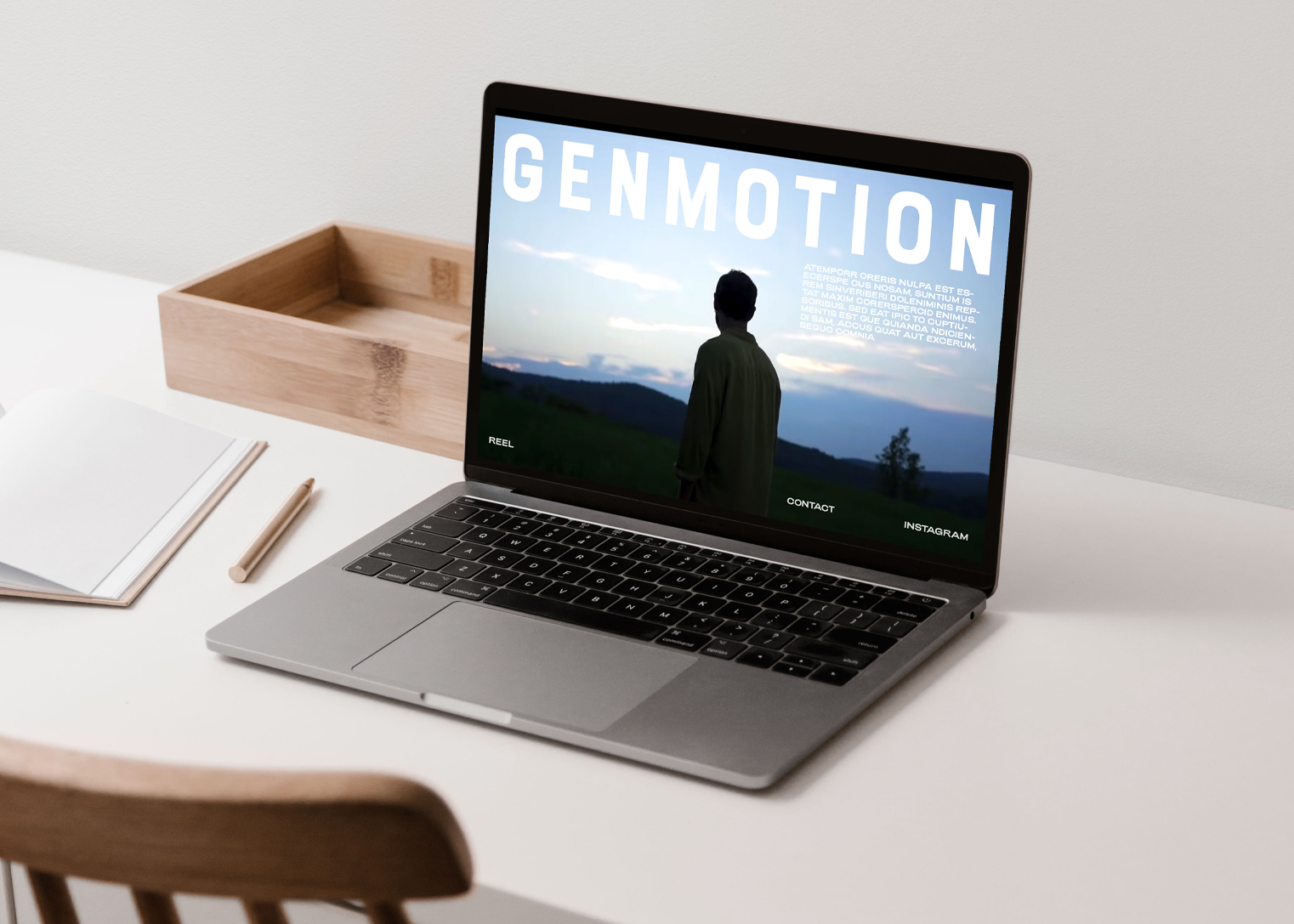
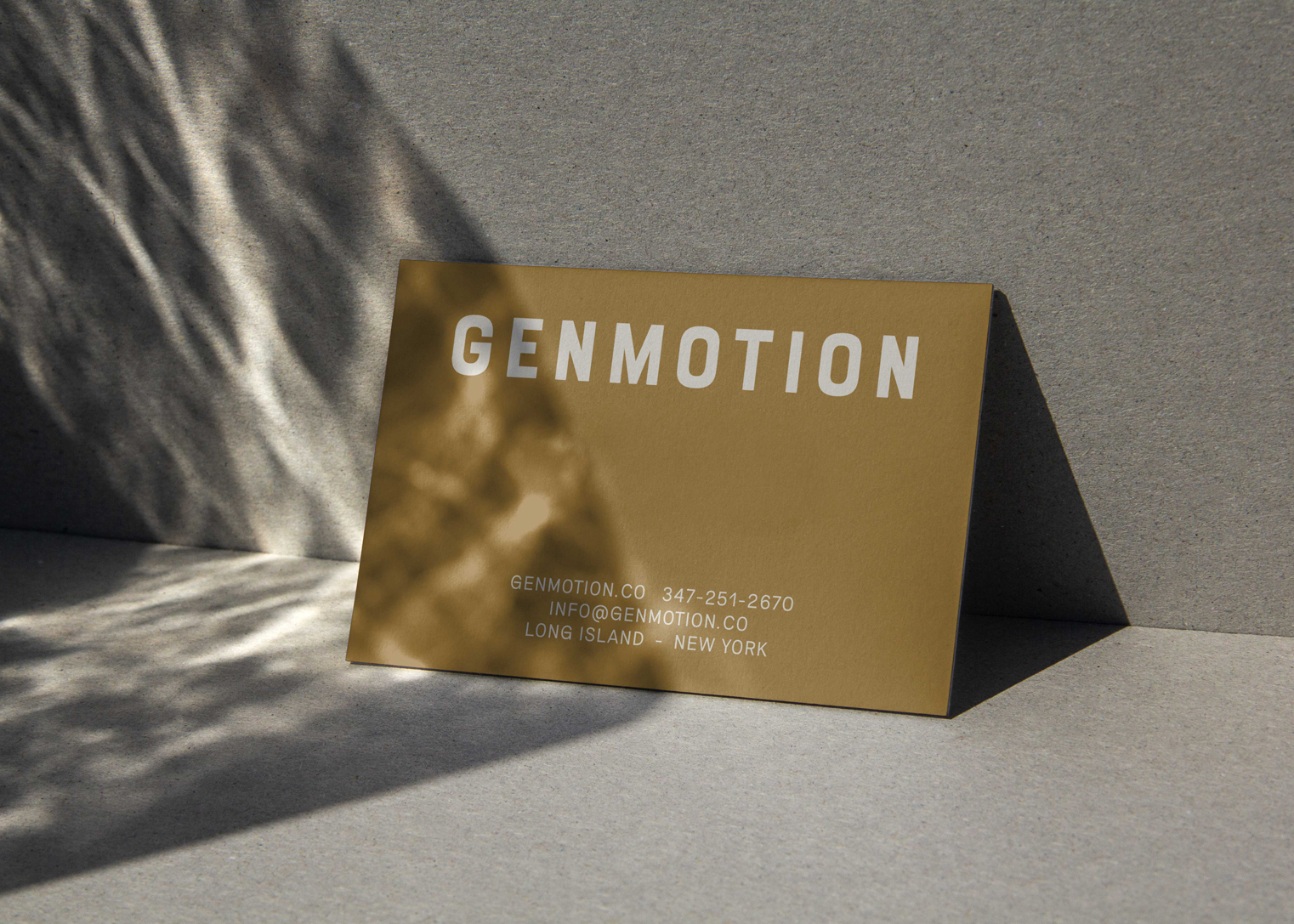
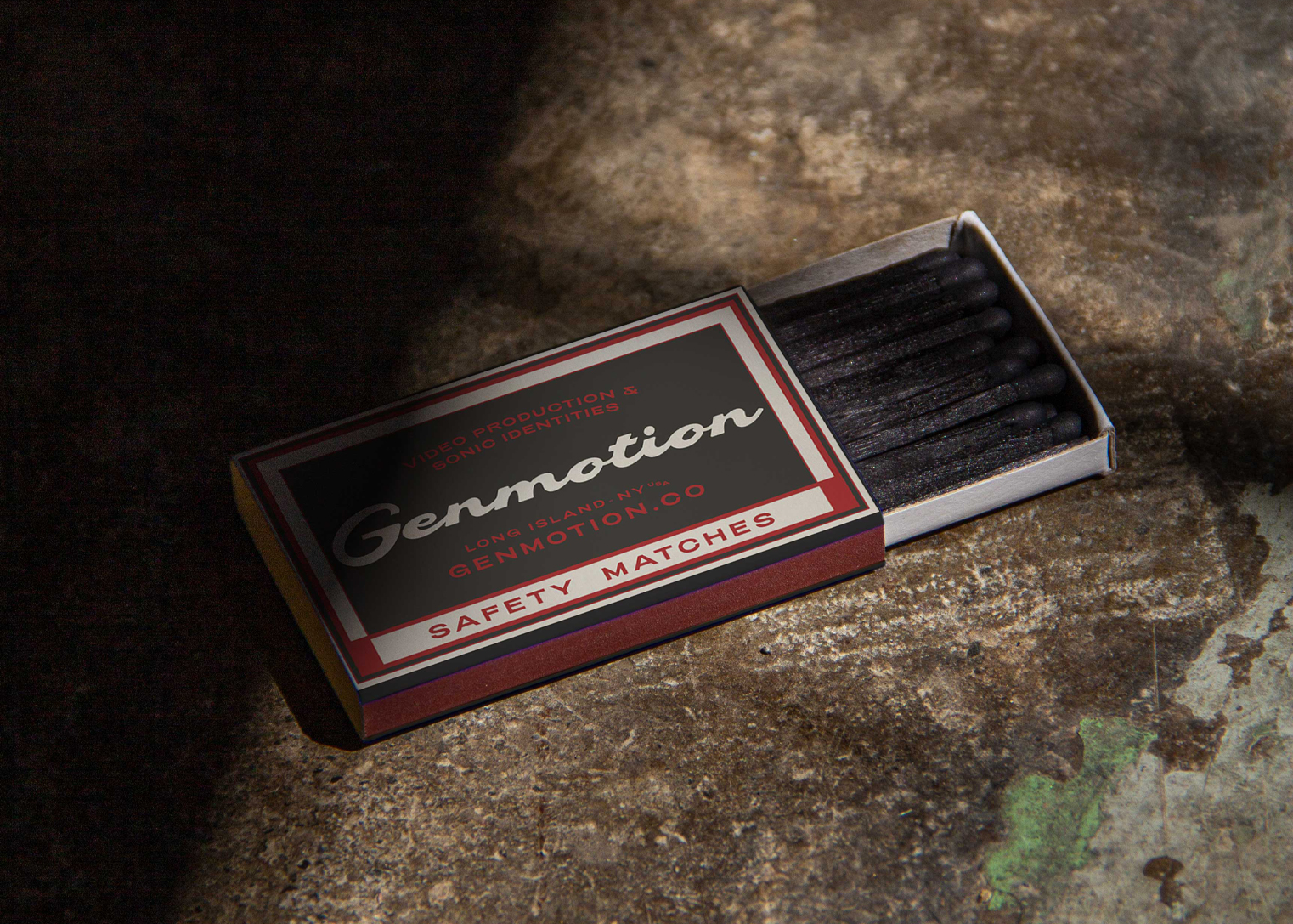
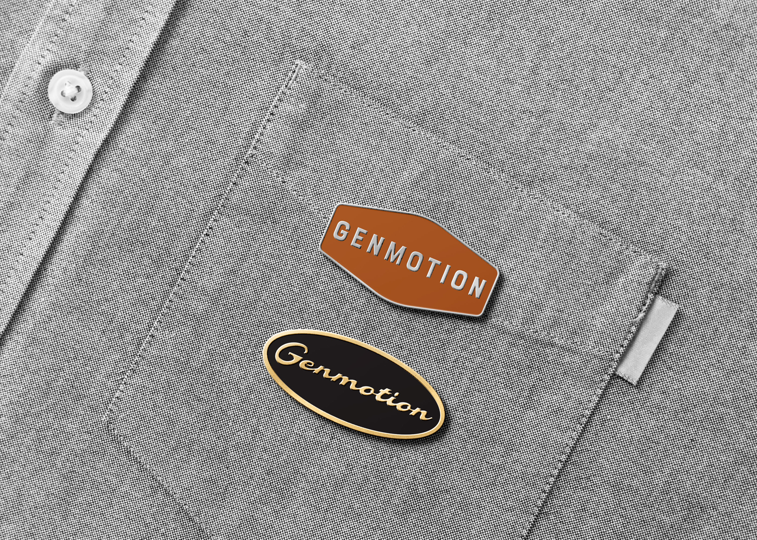
We created two wordmarks for Genmotion, the primary logo, for use on more formal applications is bold with generous spacing between each of the letters. The secondary mark, encapsulates vintage hand lettering seen on old shop signs with subtle 60’s influences.
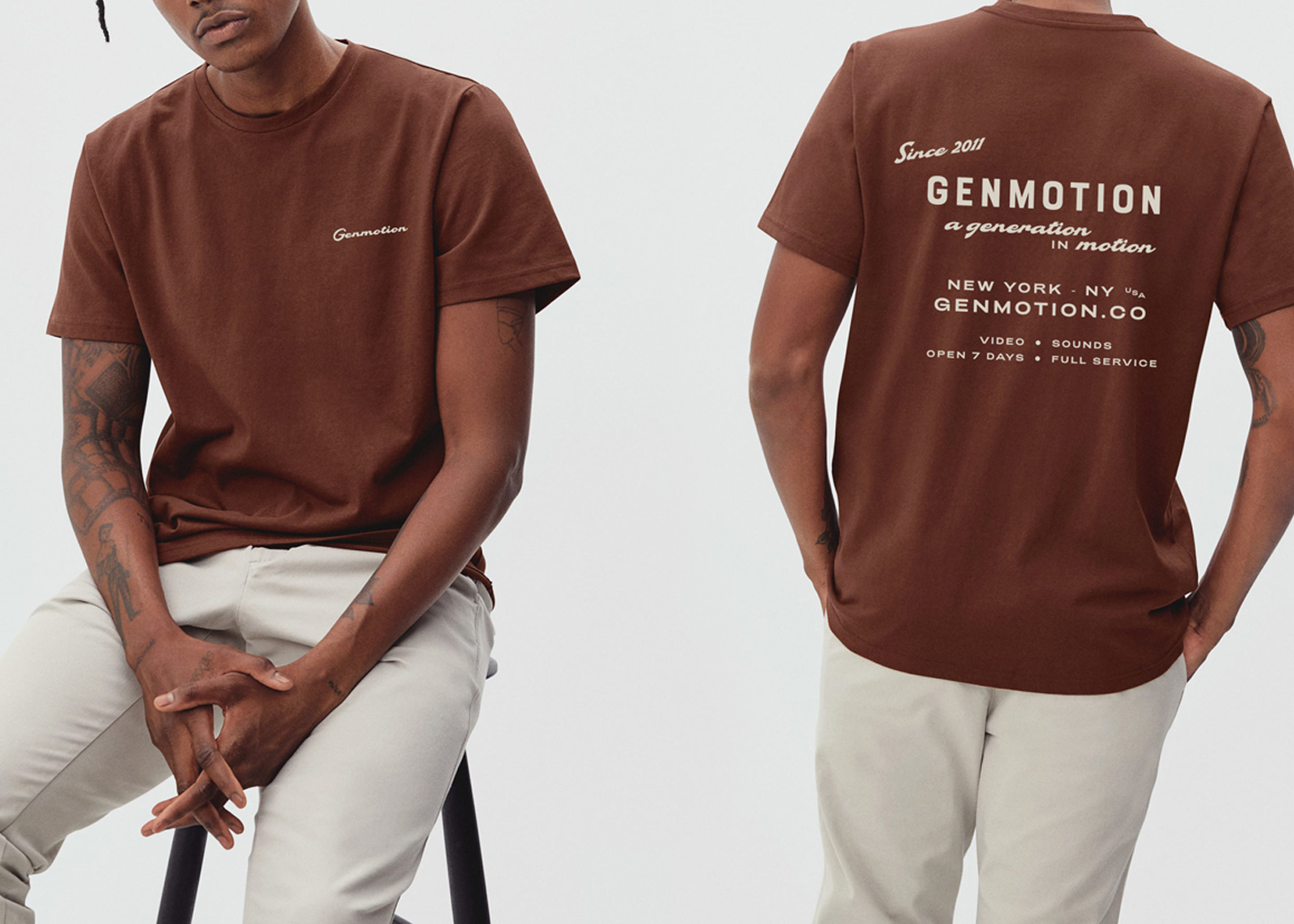
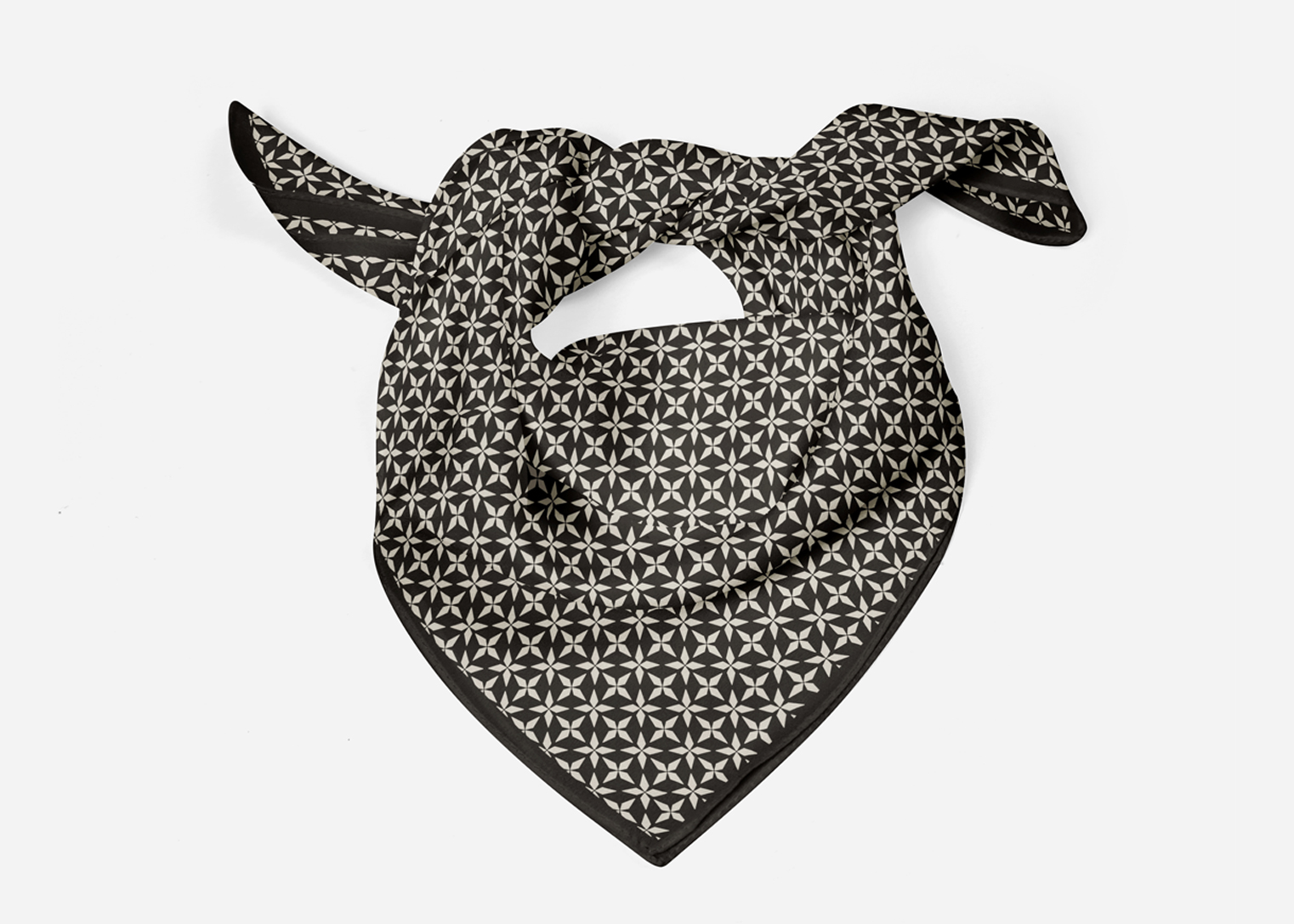
The uniform is designed to be mix and match. This approach creates a wardrobe of branded options rather than one fixed item, allowing the team to select pieces to match the job, the weather and mood.
